Affichage des articles dont le libellé est Material. Afficher tous les articles

lundi 6 juillet 2015

MLB.com At Bat gets Material Design makeover for 2015 season


mlbatbat2015


With what seems like half the United States buried in a thick blanket of snow, it’s easy to forget that in the lands of grapefruits and oranges the 2015 MLB season is well underway. Spring Training began in earnest this week, and as players prepare for the grind of another year in the big leagues fans are being given the opportunity to spruce up their app game with a new update to MLB.com At Bat.


The big takeaway is a shift toward Google’s Material Design standards, bringing a truly native look to the app which provides fans with a way to stream live video and audio of MLB games direct from their smartphones and tablets (you’ll need to pony up for a subscription to enjoy the full benefits). The new UI stretches across team color-specific designs for all 30 designs plus an overhauled scoreboard view. Also included is support for Spanish language for the béisbol fans out there. You will still need to manually adjust your device’s language settings, however.


The new app is available now to download for free. While certain features can be enjoyed without a subscription, to get the full experience you will need to pay a .99 yearly fee or .99 monthly fee.


Download MLB.com At Bat from Google Play


7 New Material Design Guidelines that Android Developers should know


materialdesign_introduction


In an effort to flesh out their Material Design guidelines, Google has released a whopping 7 new sections that’ll show you best practices for crafting user interfaces, handling data and providing an overall sensible user experience as it pertains to the current standard. Here are the new sections Google has added for developers to take a look at:
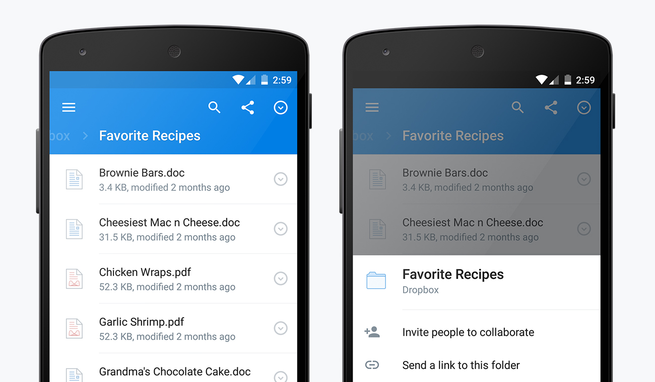

Data tables


Whether you’re including ingredients for a recipe, stats from a sports league, or results from an arcade game, Google gives you the lowdown on the best practices for incorporating data tables into your apps and websites with material design (read more).


Material-Design-Data-Tables


Units and measurements


Ever wonder why phones from the low-end to high-end seem to ignore pixel widths and resolutions? They’re not being ignored, Skywalker… it’s all a matter of pixel density (and much more).


Material-Design-Pixel-Density


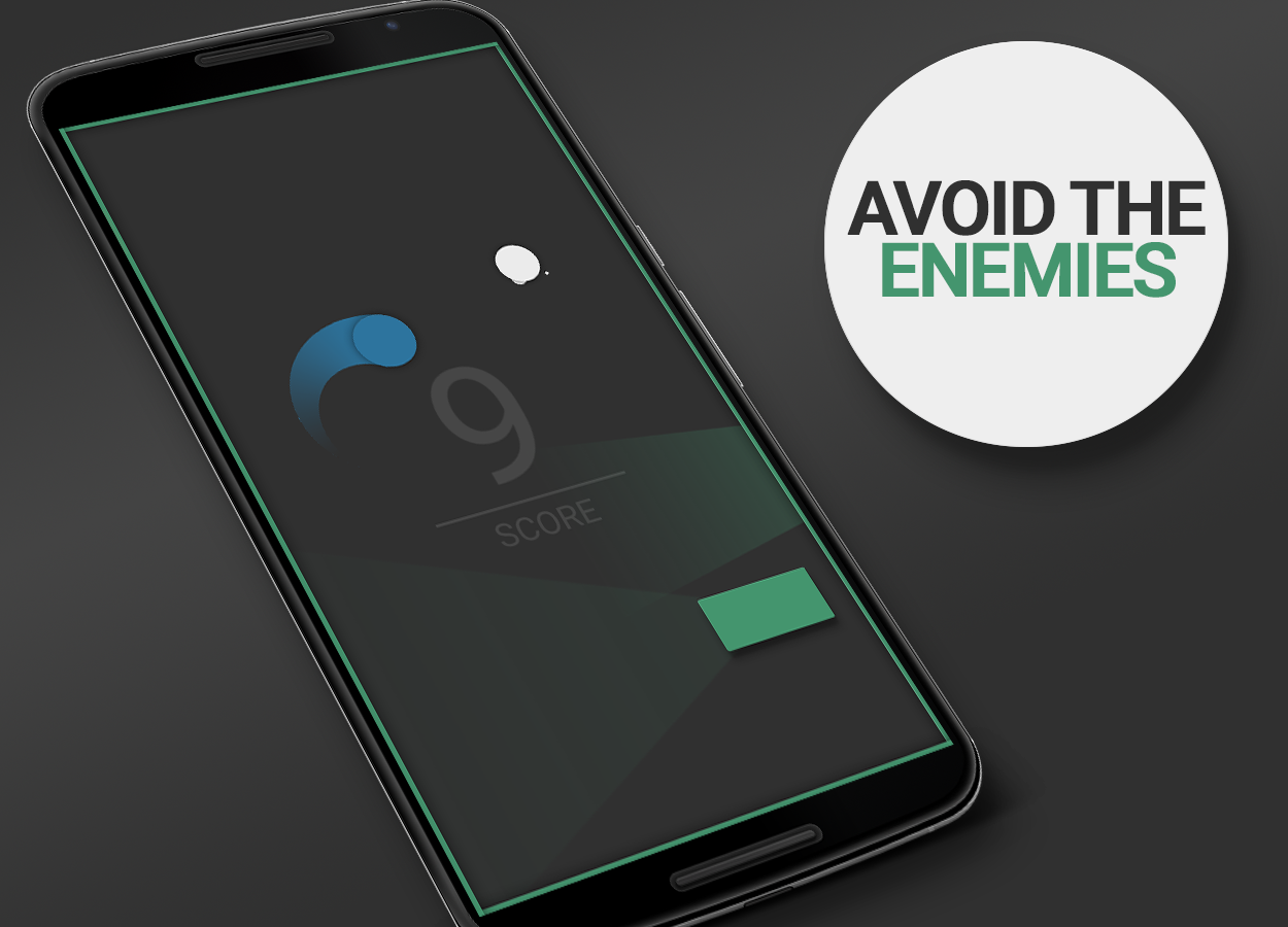
Floating Action Button


This beautiful addition to Android now gets its very own Material Design section. Learn when, where, and how to use the floating action button appropriately right here.


Floating-Action-Button


App structure


Having trouble deciding how to organize and structure the content in your app? Google has some ideas for you.


Material-Design-Structure


Adobe After Affects – Component Sticker Sheet


Users of Adobe Photoshop and Illustrator have long had access to system icons and component sticker sheets, but what about folks using Adobe After effects? Well… you’re now in luck.


After Affects Material Design


Data truncation and redaction


Feel free to show me your credit card number, expiration date, and secret pin number on the back… I’m an angel and would never use it for nefarious purposes. However, developers will want to protect their users from meanie heads by not showing important info like passwords, so Google is now helping you conform to their design standards in cases like these.


Screen Shot 2015-04-15 at 3.19.39 PM


Writing guidelines for Settings


It’s all about consistency. Nothing bothers me more than jumping into settings and not knowing what the heck is going to happen when I make a selection, so I really hope developers follow these guidelines closely.


android settings writing guidelines


And there’s more…


Google has also updated existing sections with more detailed guidelines, including topography, cards, dialog boxes, tabs and scrolling techniques. You can find all the newest changes right here, while the entirety of the Material Design guideline document is waiting for you here.


And remember developers, while you’re not forced to follow these guidelines you’d be doing yourself a favor to make sure your app conforms to the latest standards. Not only will it improve usability for your existing loyal users, but it will help you gain a lot more visibility — users tend to be a lot more willing to check your app out if they see it uses Material Design.


Mailbox gets a fresh coat of Material Design in latest update


mailbox


Another popular app is getting a fresh coat of Material Design. This time it’s the Dropbox-owned email app, Mailbox. If you’ve never used Mailbox it’s the app that started the craze of snoozing emails. Many apps have adopted that feature, but Mailbox was one of the first to implement it, long before Google Inbox came around.


With this update you can expect the normal smattering of Material goodies. A new floating action button allows you to create new emails, the slide-out drawer is cleaner, and the Search button has been moved to the top bar. Mailbox is a really nice email app if you’re someone who struggles to get to “inbox zero.” It treats emails more like a to-do list, which forces you to take action or archive. Not everyone will like that approach, but it’s free and worth a shot.


What email app do you use on your phone?


Mailbox | Google Play Store


HTC One E9 leak shows a phone plastered with glossy material


htc one e9 upleaks


Looks like HTC’s working on a new phone with some stylish good looks. It’s being called the HTC One E9, and it was leaked by a familiar source in @upleaks. Details are slim right now, but we can see that the phone borrows design cues from the best of both the mid-range and high-end tiers of HTC’s device lineup.


The front of the device is more akin to an HTC One M8 / M9, complete with BoomSound speakers and a bezel with an oddly-placed logo. Flipping it to the rear reveals what appears to be a glossy plastic material that’s often used for HTC’s Desire lineup.


An earlier leak suggested the device would come with some pretty capable hardware:


  • 5.5-inch QHD display

  • 2.2GHz Octa-core MediaTek MT6795 chipset

  • 3GB of RAM

  • 32GB if internal storage

  • 20 megapixel camera


Not bad, though fans of Qualcomm’s might opt to pass. HTC is said to be launching the device in China before month’s end, so we’ll have to wait until then before we’re let in on any other details. Would you buy one if it were made available in your area?


Evernote is the latest app to get dipped in Material Design


all_phones_evernoteversion2-1024x886


android-animation-2It seems like every day more and more apps are adopting Google’s Material Design language (and we love it). The latest app to get a Material makeover is the uber-popular Evernote. Everything you’ve come to expect from Material Design is present in the new Evernote. Floating buttons, thoughtful animations, clean fonts, colorful status bar, and more.


The update isn’t only about aesthetics. Evernote has taken the time to also improve note editing and viewing. They’ve also simplified the controls and updated the navigation drawer with more personalization. Lastly, new notebook covers will help you differentiate your notes. Overall this is an excellent update for an already stellar app.


To celebrate the big update Evernote has shared an interview with Android product manager Theresa Pittappilly and designer Adam Glynn-Finnegan. If you’re interested in the design process it’s a great read. They also shared some cool photos, like the one below that shows the evolution of the Evernote Android app. Download Evernote for free right here.


Click to enlarge

Click to enlarge


Wunderlist gets a Material Design makeover and new features


Wunderlist


Another app is getting some Material Design love. This time it’s the popular list-making and productivity app Wunderlist. The team has been hard at work the last few months building Wunderlist from the ground-up for Android Lollipop. Not only does it have a fresh coat of Material paint, but they’ve also added some really nice new features.


First and foremost is the new design. We’ve got colored status bars, floating buttons. meaningful animation, and a much more clean and refined look. It’s not a drastic re-design, but it’s just enough to make it feel at home in Android Lollipop.


Wunderlist has also added a few new handy features. First is the ability to put lists into folders. As you can see in the screenshots above I have two lists inside a “Shopping” folder. They’ve also made it much easier to add things from anywhere. You can create a new list or to-do with the floating (+) button, but also use the new widgets, or your voice with Google Now. All of these features are free for everyone.


If you’re looking for a great list-making app with sync across tons of devices and support for collaboration you can’t go wrong with Wunderlist. Download it for free from the Play Store today.


Nova Launcher gets some Material Design love in latest beta


nova


One of the most popular 3rd-party launchers is getting some Material Design love today. Alpha testers have been using the Material Design version of Nova Launcher for a little while now, and it’s ready to graduate to public beta. There are plenty of new Material goodies for Nova fans to enjoy.


First and foremost is the brand new look and feel of Material Design. You might not notice it immediately on your home screen (depending on your set up), but diving into the menus and settings will show a brand new look. A long-press on empty home screen space will bring up a more modern dialog instead of the old 2.x style pop-up. You’ll also notice a new red and white theme in the settings with smooth Material animations.


nova search


A new feature that I really like can be found in the app drawer. When the app drawer is opened you can swipe down from the top to bring up a search bar and list of recently installed or updated apps. This is super handy for trying to find apps quickly. Another new feature is the awesome app icon layout editor (seen above). You can also now adjust icon size and font size independently for desktop, drawer, dock, and folders.


All of these new #materinova features will eventually come to the stable version of Nova Launcher. If you don’t want to wait for that you can opt-in for Nova Launcher Betas from Google Play by following these steps. Check out the full changelog for below.


  1. Join the Nova Launcher Beta G+ Community (This is not optional)

  2. After joining, Opt-in for Nova Launcher

  3. When a new beta update is available you will get it through the Play Store


Nova Launcher beta
Nova Launcher beta
Nova Launcher beta
Nova Launcher beta
Nova Launcher beta
Nova Launcher beta
Nova Launcher beta
Nova Launcher beta

#materinova.14 public beta 1


  • Full Material Design

  • Google Search from the search bar shows as an overlay

  • Edit Shortcut dialog, and quick menu, tinted based on colors of the icon

  • New icon

  • New Nova Action icons

  • Rebased on top of Launcher3

  • Individual icon layout settings (size, font, etc) in Desktop, Drawer, Dock, Folder

  • Max icon size boosted to 150%

  • Widget Search

  • Pull to search (pull down in the drawer to open app or widget search)

  • Widgets given their own drawer, removed from App Drawer

  • Ability to change Page Indicator color

  • Drawer Tab Bar completely optional

  • Support for Android for Work managed profiles (Lollipop)

  • Workaround Expand Notifications Nova Action not working on Samsung Lollipop

  • Requires Android 4.1 or higher (Dropped support for Android 4.0 ICS)

  • Unlimited desktop pages (previously limited to 9)

  • Add/remove of desktop pages by dropping icons on the blank page, or removing all icons from a page

  • Add blank desktop pages (for gestures or live wallpapers) from overview

  • Improved bulk edit of folders (Folder > Menu > Select Apps)

  • Added shadows to unread badges

  • Unread Badge size scales with icon size

  • Allow reordering drawer folders by drag/drop within window

  • Added Roboto-Medium font option

  • Improve handling of apps installed to sdcard


Nova Launcher 4.0 brings grouped widgets, full Material Design, circular app animations and 25+ other changes


adbtmp.mKmR


Nova’s Material Design update has been a long time coming for those who aren’t particularly crazy about beta testing, but the wait for it to hit the stable channel is finally over. Nova Launcher 4.0 is out on Google Play, and it stands to be one of the biggest updates yet for the premier home screen replacement.


The biggest changes will be a more refined Material Design user interface, including new animations, updated fonts, new material-themed wallpapers and other aesthetic-focused things. The full list is rather large, and rightfully so: this has been in the works for a few months now, with the last version — 3.3 — having been released as far back as December 2014.


adbtmp.2KOw
adbtmp.mKAq
adbtmp.dF1c
adbtmp.7vGx

Here’s a full list of changes you can expect if you haven’t been using the beta:


  • Full Material Design

  • Google Search from the search bar shows as an overlay

  • Edit Shortcut dialog, and quick menu, tinted based on colors of the icon

  • New icon

  • New Nova Action icons

  • Rebased on top of Launcher3

  • Individual icon layout settings (size, font, etc) in Desktop, Drawer, Dock, Folder

  • Max icon size boosted to 150%

  • Widget Search

  • Circular App animations (Settings > Look and Feel > App Animation > Circle)

  • Pull to search (pull down in the drawer to open app or widget search)

  • Widgets given their own drawer, removed from App Drawer

  • Ability to change Page Indicator color

  • Drawer Tab Bar completely optional

  • Support for Android for Work managed profiles (Lollipop)

  • Workaround Expand Notifications Nova Action not working on Samsung Lollipop

  • Requires Android 4.1 or higher (Dropped support for Android 4.0 ICS)

  • Unlimited desktop pages (previously limited to 9)

  • Add/remove of desktop pages by dropping icons on the blank page, or removing all icons from a page

  • Add blank desktop pages (for gestures or live wallpapers) from overview

  • Improved bulk edit of folders (Folder > Menu > Select Apps)

  • Added shadows to unread badges

  • Unread Badge size scales with icon size

  • Allow reordering drawer folders by drag/drop within window

  • Added Roboto-Medium font option

  • Improve handling of apps installed to sdcard


The download is sitting over at Google Play right here so be sure to grab it as soon as possible.


Google highlights their favorite Material Design apps on Google Play, here’s the full list


Google Design


Hot of the heels of Google I/O 2015, Google’s Design Team is ready to talk about, what else, but design. During I/O, they gave their entire site a fresh new Material design overhaul. As most of you know, Material is Google’s new design language that was introduced last year in Android 5.0 Lollipop and bled out into all of Google’s web services.


Material design focuses on clean, minimal design with bold colors and typography that emphasize depth and are brought to life with gorgeous animations. Still confused? Simply put, it’s a lot like paper. Well, maybe the Google design team can explain it better in their latest video:


While we’re just now seeing more and more Android apps follow this design philosophy, some definitely do it better than others. There’s no better way to show what Material Design is than by simply showing you. That’s why Google’s Material Design team decided to showcase their favorite apps adhering to their guidelines in a new featured page in the Google Play Store.


Google Material Design app picks


There’s 18 apps total ranging from fitness to messaging and everything in between but Google hand-picked 6 which they felt excelled in specific areas for their first ever “Material Design Awards.” Here are the top picks:


B&H Photo Video Audio Pro for Immersive Imagery


New York Times for Elegant Typography


Pocket for Adaptive Layouts


Pocket Casts for Seamless Browsing


Tumblr for Delightful Animation


Weather Timeline for Crafted Simplicity


If you’d like to see all the others are featured, the full list can be found over on Google’s landing page here.


AllCast 2.0 brings a fresh Material design makeover [DOWNLOAD]


AllCast tablet UI


Even when you’re a developer as big as Koushik Dutta, getting your apps up to speed with Google’s Material design isn’t the easiest of tasks. Sometimes you need a little help and he got just that thanks to designer/fellow blogger Liam Spradlin who whipped up a fresh new Material look for AllCast in its new 2.0 update.


It’s not like AllCast was bad looking before, but this brings the app up to speed with Google’s Material guidelines. Small changes to the slide-out navigation menu can be found with slick new icons, along with the gallery view also receiving some love.


AllCast 2.0 update Z (1)
AllCast 2.0 update download
AllCast 2.0 update download (1)
AllCast 2.0 update 9k= (1)

Without a doubt, AllCast is one of those must-have Android apps for Google’s Chromecast owners as it allows you to cast just about anything to the dongle. Whether it’s media stored on your device, or in the cloud, AllCast makes it all possible. The free version of the app caps video viewing at 5 minutes, but there’s also AllCast Premium which will run you .


Google Play Music gets fresh new Material Design makeover on the web


Google Play Music web Material design


After watching as Google’s Material Design guidelines have crept its way into many of the search giant’s online services, today the Google Play Music website is getting a little bit of love. The UI now finally looks a little closer to the makeover the Android app received not too long ago with big high-res artist photos for backgrounds, circle photos on the artist page, and FAB.


The website also adds a handful of new keyboard shortcuts and even a handy popup player with easy access to your music queue. Apparently the new redesign was an attempt at making the web view feel more like an app. Google UX designer Bran Rea told The Verge:


“We’re moving towards making the web feel more like an app and less like a series of web pages strung together by links. The new header, the slick transition as you scroll, the collapsible nav, new animations, these all feel like things you expect in an app not on the web.


For the increased focus on big, immersive artwork, when you’re listening to music, you can get lost in it (in a good way). With the new album and playlist pages, you enter an immersive world focused on the music you’re enjoying.”


We know it’s not specifically Android related, but given that Google Play Music is such a popular music streaming service for Android faithful, we figured it was worth a shout out. If you don’t see the changes yet on your side of the world, don’t worry. It’s a gradual rollout and you should be seeing it in the coming days.


Google Play Store 5.5 brings even more Material design animations and other small tweaks [DOWNLOAD]


Google Play Store


Just because OEMs seemingly never got the “Material design” memo doesn’t mean Google isn’t doing their part to show the world how its done. There’s probably no better place to find well-executed Material design than Google’s very own Play Store app.


Googler Kirill Grouchnikov posted onto his Google+ page about some new changes rolling out in the new Google Play Store update 5.5. It’s nothing too drastic, just some slightly tweaked UI animations and other small changes. But it’s enough to make us wish all our devices were running the most up-to-date version of Android as only those on Android 5.1+ are able to view them. Phooey.


You can either wait days (or even weeks) for the update to finally hit your device, or download the apk download for sideloading. Enjoy.


Download: Google Play Store 5.5.8


If Material Design was a game, it would look like these three Android games [VIDEO]


I love simple games and I love Material Design. So when I first discovered a game called Bing Bong I was very excited. It combined simple and addictive gameplay with a Material-esque design. Then I found out that the same developer had made other games with the same style. The three games can stand on their own, but together they make for an addictive combination. Let’s take a look.


Bing Bong


Bing Bong screens


I’m not sure which game came first, but Bing Bong is the one I played first. In this game you control a green dot that is constantly going up and down across a street of traffic. Each time you successfully get to the other side you earn a point. You have to avoid blocks of varying sizes to cross the street. The green dot is constantly moving, but you can slow it down by pressing your finger on the screen.


The game becomes all about timing. Will you be able to make it past that block at full speed? If you slow down now will that make you hit the next block? You’re constantly adjusting your speed to perfectly cross the street unharmed. It’s easy at first, but gets difficult quickly.


Righty Tighty


Righty screens


In Righty Tighty you play as a red dot. Your goal is to collect the white dots and bring them to the goal. The red dot is constantly moving, but every time you tap the screen it will make a right turn. Like in Bing Bong, there are blocks of varying sizes constantly crossing your path. Also, the red dot is constantly growing, which makes it increasingly more difficult to avoid obstacles. You have to return a white dot to the goal to reset your size.


Pivot


Pivotscreens


The simplest of the three games is Pivot. You play as a blue dot this time, but you still have to collect white dots to earn points. The blue dot is constantly moving in a circular path. Tap your finger on the screen to go in the opposite direction. There are no goals this time. You get a point for simply collecting a white dot. Blocks of varying sizes are still trying to get in your way, and the wall is also an obstacle.


***


I like these games a lot because they feel like a family. Each one has its unique aspects, but they all share the same basic foundation. They’re beautifully simple, yet extremely addictive. The developer has done a great job with the little details, like how the music intensifies the longer you survive in Bing Bong.


All three games have Google Play Game integration for leaderboards and achievements. The games are free with very few ads (which can be disabled completely for .99). You can download all three in the Play Store. Enjoy!


Dropbox for Android 3.0 brings a full Material Design makeover


dropbox 1


Dropbox has announced a nice new upgrade to their Android app. It’s Dropbox 3.0, and the main highlight is that the app is now doused in a full coat of Material Design. We’re finally getting an excellent use of white space, drop shadows, and — oh yes — that glorious floating action button (which will allow you to easily add files and photos to whichever folder you’re in while you press it).


dropbox 2


There weren’t many other functional changes made to the app, though you’ll notice a persistent search button throughout the app, as well as more consistent placement of sharing and file management controls throughout the app.


dropbox 3


The upgrade should be headed to your phones and tablets shortly, so be sure to keep an eye out on Google Play throughout the course of the day. Oh, and check out the cool new user animation video they’ll be using straight ahead.


[via Dropbox]


Make your Samsung Galaxy S6 and S6 Edge look like AOSP Material Design with this theme


galaxy s6 material theme


There are many people out there who aren’t fans of TouchWiz and were elated to hear Samsung might go with a stock-like design for the Samsung Galaxy S6’s user interface. Unfortunately that never came to pass, but that doesn’t mean you can get something close to the real deal.


One designer has finished a Material Design stock-looking theme for the Samsung Galaxy S6 and S6 Edge, and it’s now available for free over at the Samsung Theme Store. What you’ll get is a theme that’ll make your phone resemble something like a Nexus thanks to new designs for the dialer, notification shade, icons and other system elements.


Samsung’s influence will still be quite prevalent throughout much of the user interface, naturally, but at least you can feel a bit more at home if you’ve been missing that AOSP look and feel. Be sure to head to the Samsung Theme Store on your phone and give it a try!


[via Google+]


Slack for Android gets Material Design makeover in version 2.0


slack material design


Slack, a rich team communication platform, has updated their Android app in a big way. This is version 2.0, and it’s a complete rewrite from the ground up. The company felt the app needed to be done from scratch so that they were better-equipped to support Android’s unique features down the line.


The first thing you’ll notice when entering the new app is a complete Material Design overhaul. Dropshadows, white space and FABs, oh my! It’s certainly a lot better than the archaic mess that spawned in the Ice Cream Sandwich days.


There’s a long list of new additions and changes that should make the lot of you Slack users happy:


  • Slick new ways of navigating around the app

  • Simple tabbed navigation

  • ‘jump to’ option for channels, DMs and private groups

  • Team switcher dropdown menu

  • Refined notifications

  • Support for Message formatting

  • Support for Android emoji

  • An enhanced search function

  • Local message storage


The upgrade is headed out through Google Play over the next couple of days so keep on the lookout for it. Haven’t tried Slack yet? You can give it a free download right here to find out if it’s right for your business, student group or whatever it is you may need it for.


[via Slack]