Affichage des articles dont le libellé est M’s. Afficher tous les articles

lundi 6 juillet 2015

Android M’s new launcher has an app drawer you’re probably going to hate [VIDEO]


Android M app drawer


With the exception of HTC’s Sense UI, it’s been awhile since we last saw a vertical scrolling app drawer on Android. Ever since Ice Cream Sandwich ditched Gingerbread’s vertical scrolling app drawer for a nice horizontally scrolling one, it just felt… well, right. While Froyo’s cubed shaped app drawer will always hold a special place in our hearts, we’ve loved the way vertical scrolling felt.


Last year’s Lollipop update added a little spin on the classic home screen with an all new Google Now launcher featuring easier access to Google Now and white cards in the app drawer. It’s crazy to think that Google is already changing things up again this year and it’s pretty drastic.


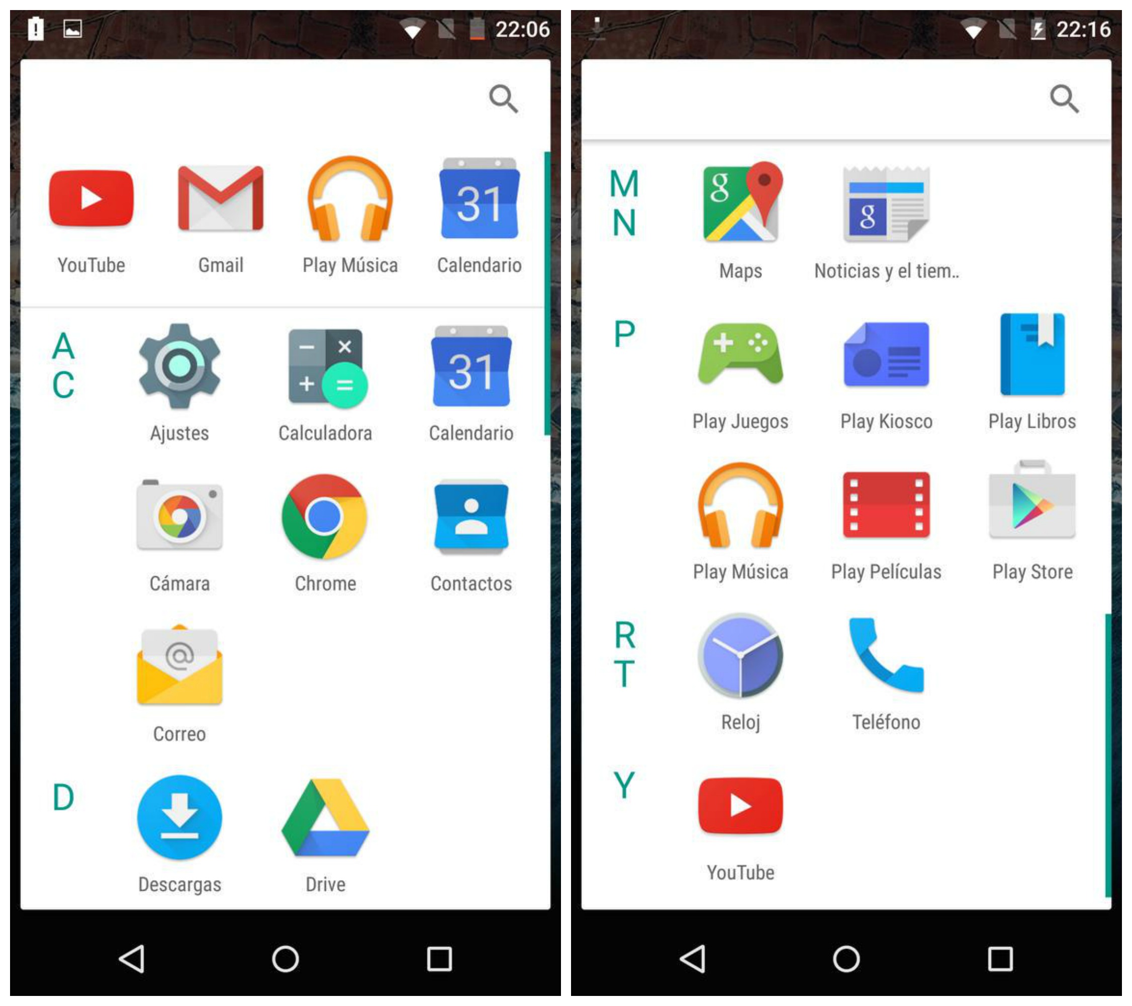
The Android M Developer Preview features a new throw-back launcher with an app drawer that scrolls vertically, something we haven’t seen since Android’s early days. Upon opening, a row of recently used apps can be found along the top (something we’ve recently seen in 3rd party launchers) along with apps that are now sectioned off by the alphabet.


You’ll also notice a new app opening animation that kind of zooms out from the app icon itself (although backing out of an app still uses the old Lollipop animation). Oh, and if uninstalling apps from the app drawer wasn’t easy enough, you can now do this by dragging icons straight from the launcher itself. You can see what we’re talking about in the video below.


We have to say, it’s a strange move but of course this is a developer preview and anything can change in time for M’s official release later this year. In either case the vertically scrolling app drawer wont mean much to many of you already invested in one of Android’s many 3rd party launchers.


Thanks, Hernan!


Lollipop’s sound profiles were confusing, Android M’s are much clearer


Android M sound controls


Android VP of Engineering Dave Burke addressed criticisms surrounding the Lollipop’s awful sound profiles head-on while on stage at Google I/O. Along with “thousands” of bug fixes making their way to Android M, arguably one of the bigger bugs was Lollipop’s convoluted sound profiles which made sense to just about no one and didn’t really behave the way they had in previous versions of Android.


Android M sound profiles 1


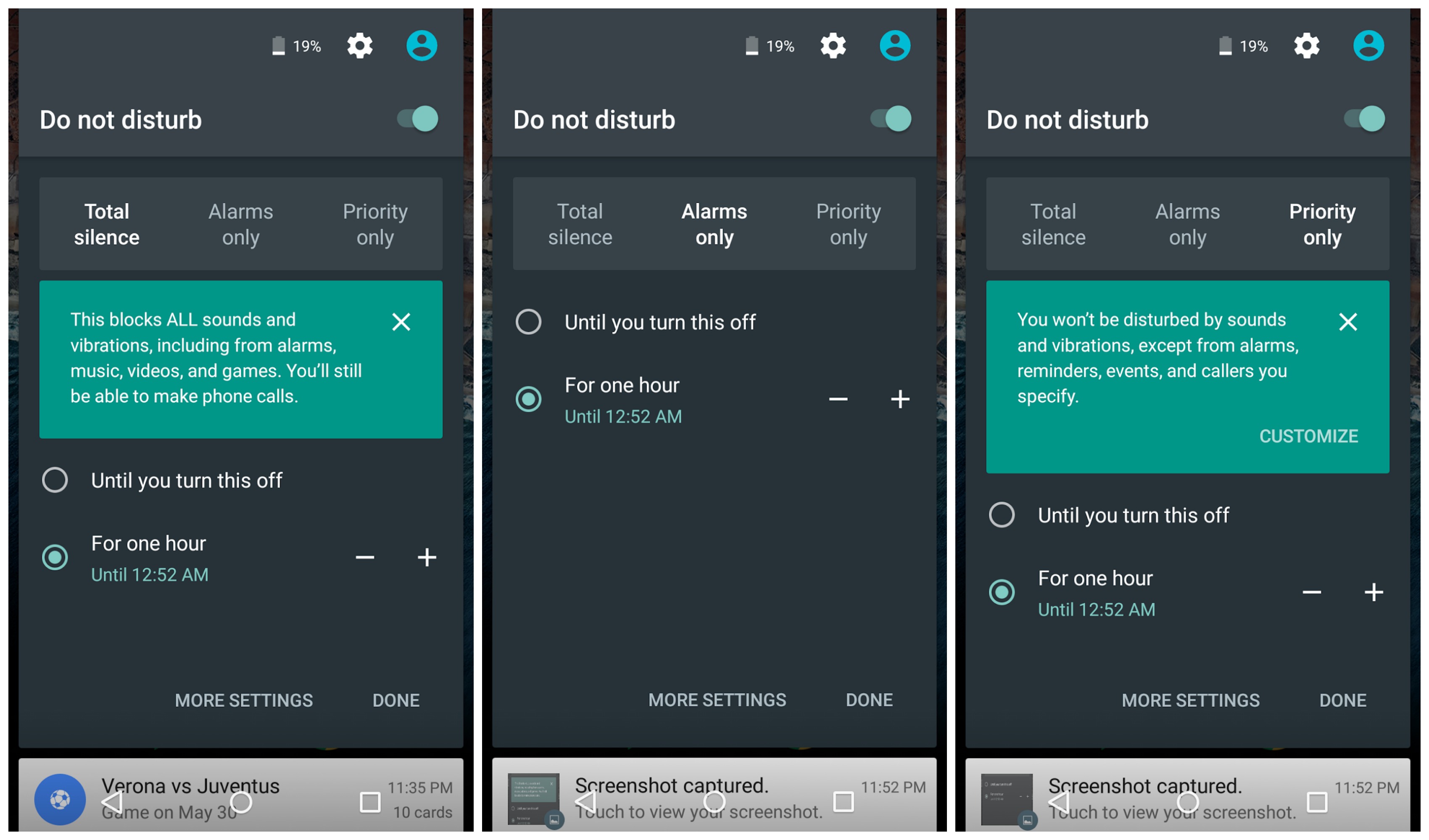
For Android M, Google’s making things a little bit simpler with new and improved controls. Currently, changing the volume in Lollipop brings up the volume slider along with the options to choose between no sounds at all (even alarms), priority notifications, or all notifications.


Android M has a similar UI, only now it spells things out more clearly with a first-time popup message explaining each option in plain language. There’s also a handy drop down when adjusting the volume to control audio output for notifications and alarms individually. Again, it’s not too drastically different from what we had in Lollipop, but it’s better and better is good.


Thanks, Hernan!


Android M’s system UI tuner lets you rearrange or delete quick settings in the notification area


Android M System UI tuner quick settings


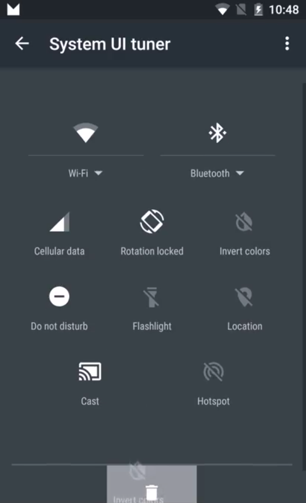
With the Android M Developer Preview readily available for the flashing, more details about the update are being uncovered every minute. Our friend Hernan Castanon uploaded a quick video showing off Android M’s new system UI tuner located in the settings app.


The setting allows users to rearrange or delete those quick toggles found in the notification area. Once again, it’s a feature many have been asking for since quick settings became a thing, but there’s no way to tell if this will stick around for M’s official release later this year. Either way, it’s pretty sweet.